Quirk Art Supplies
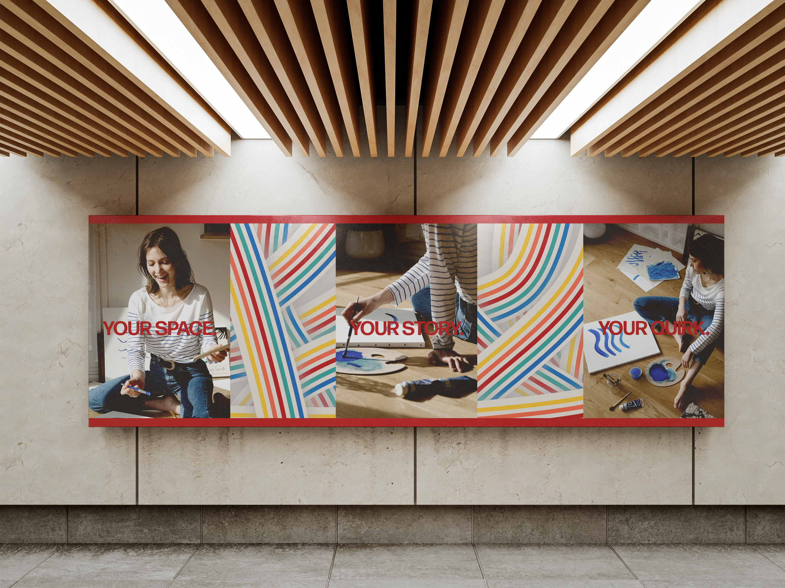
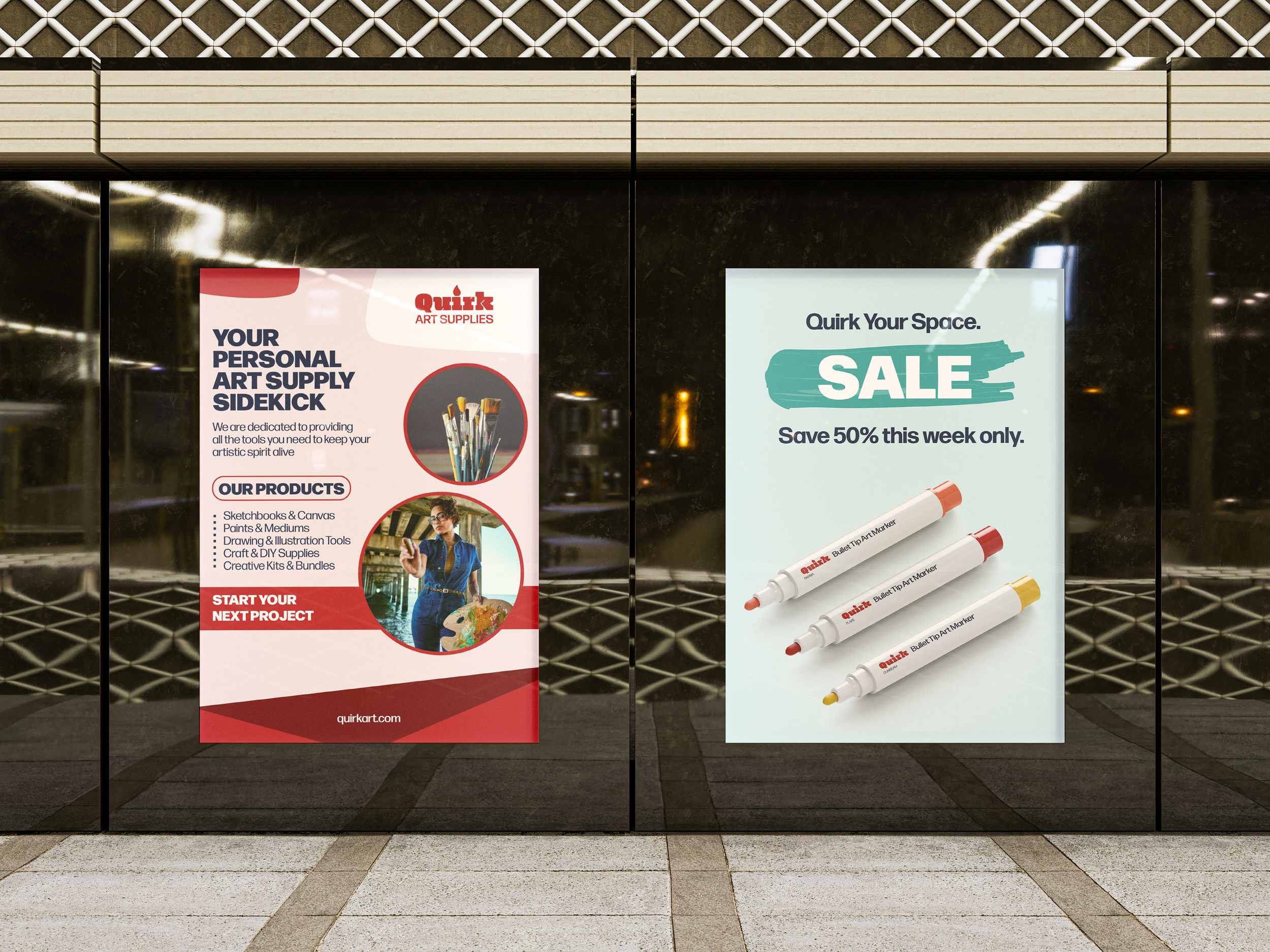
For this project, I designed for Quirk Art Supplies, a nationwide chain known for making art accessible through affordable and convenient products. My focus was on highlighting their balance of professionalism and wonder while reflecting their strong commitment to sustainability and community support. Quirk prioritizes giving back through local art programs, and I wanted the design to carry that sense of purpose.
Target Audience: Creators who live alone.


Reflection
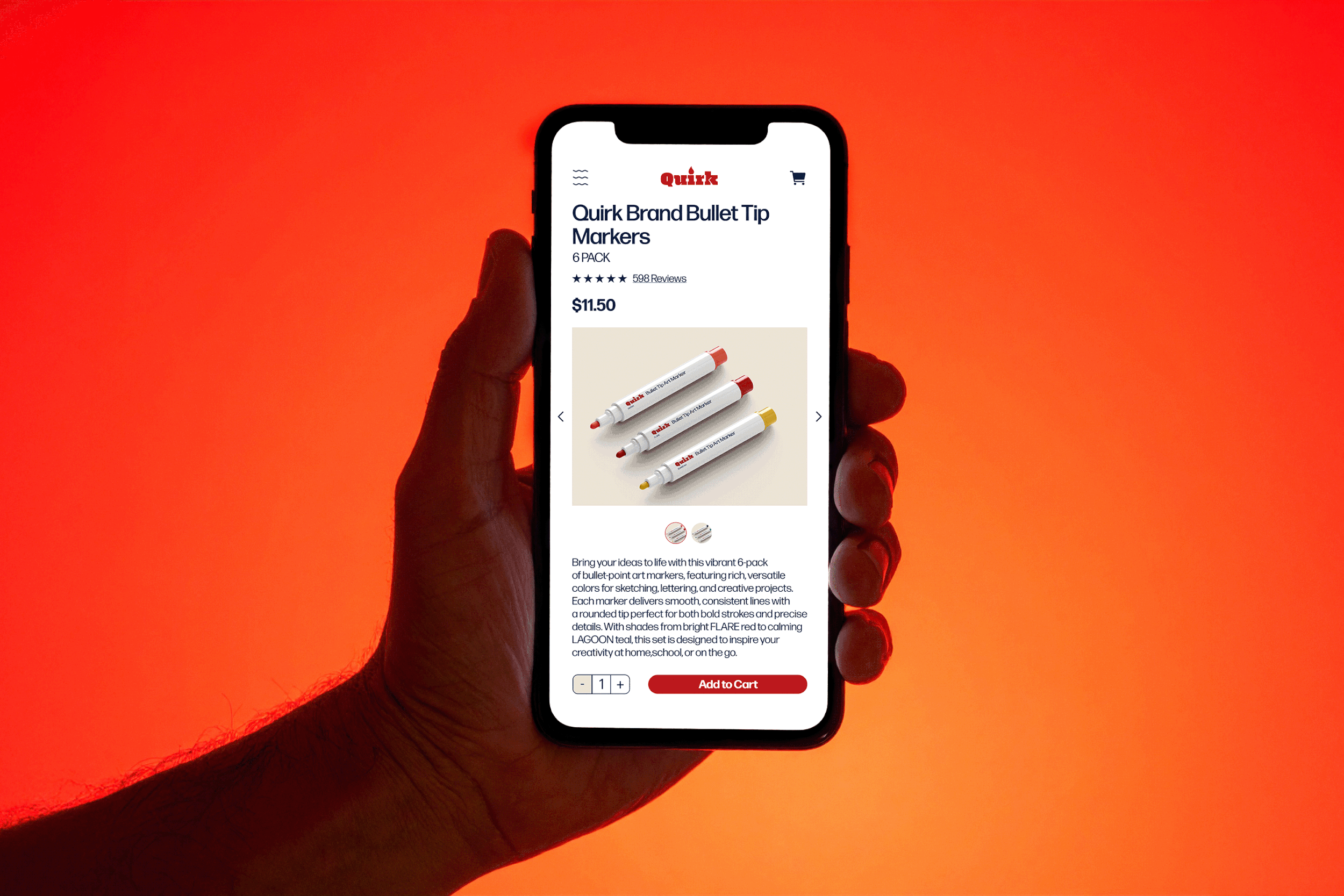
I was given the central objective of using the color red for the logo and ensuring it was a combination mark. I chose a chunky serif typeface to balance the playful and professional elements of the brand. I modified the tittle of the ‘i’ to resemble a paintbrush head, which ties into the company while remaining simple enough that the detail would not be lost at smaller sizes. I also considered colors that complemented the main red while reflecting the brand’s ethos. This led me to develop a small rainbow-inspired palette that makes up the pattern I used for brand applications. In this way, the brand’s values could be represented without relying solely on placing the logo on every company-related item.